CODA Basic Instructions

CODA Basic is Adsense ready responsive blogger template.

Here are some of the instructions you might need when using CODA Basic.

1. Blog Header.
The theme uses a blog header widget which you need to define. You can use text header but a logo based header would look better.

2. Removing/editing header links.

Go to edit template, click anywhere in the editor and press CTRL + F and enter "header" without quotes.
Just below the header you will find the desired links you wan to edit as shown in the picture.

3. Removing/replacing Ads.
There are 2 ad units integrated in the template for easy usage.
First is the bill board of size 900x280 and other is the links ad unit between the post.
To remove or edit the billboard ad unit go to template editor and search for "adsenseBillboard" and remove the part between container and primary division.
To remove the links ad search for "adsenseLinks" and remove the part as shown in the image below.


In case you want to add your own ad units, you have to put it in the predefined division "adsenseBillboard" and "adsenseLinks" then encode the ad unit.
Or you can use the following code and replace your converted ad code for blogger.

                    <div class='adsenseBillboard'>


                    ///////your converted adsense billboard code here //////

                    </div>


and for the links


                    <div class='adsenseLinks'>


                    ///////your converted adsense links code here //////

                    </div>

Finishing up our First Blogger theme


I used this for my sidebar.

.sidebar li {
    text-transform: uppercase;
list-style: none;
line-heigth: 1.4px;
}
.sidebar h2 {
    font-size: 14px;
    font-weight: 400;
    text-transform: uppercase;
    margin-left: 30px;
    margin-top: 30px;
}
.sidebar .widget {
    font-size: 12px;
}


Of course you are free to play around with whatever you like.

Also I have added CSS to make a read more button at the home page as follows.

.readmore a {
    padding: 8px 15px;
    text-transform: uppercase;
    background: #333;
    color: #fff;
}

.readmore a:hover {
color: #FFFFFF;
text-decoration: none;
}

Then I defined a little CSS as

.post-footer{
    padding: 18px 22px 10px 22px;
    background-color: #f5f4f4;
}
.primary h3 {
    font-size: 2em;
}

Now the post-footer part is the one where "Posted by eff on 12/12/16 ..etc" is written. This is done to distinguish it from the post content. And I just resized font in the title on home page.
With this I conclude my blank template. It will be available for free download and will be open source. You can create your own versions and let me know if you like.

I would feel proud to display them on here for downloads.

The complete blank template download is below.

Making the homepage more attractive and simple

Uptill now we have a responsive design which has little to no design CSS added to it.
This time we are going to add a little bit to the design. We are going to make post summary and post images to appear on the homepage as or like featured content.
In short we are going to make post thumbnails, and summary for our home page.
To do this I took help from this post.

To do this we use a Javascript that uses the first image in a post and creates an excerpt which then is shown.

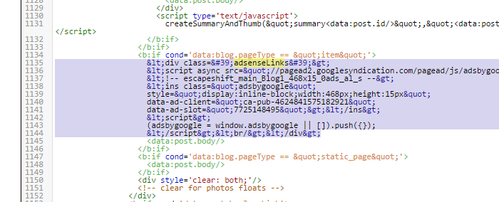
To do this search for

<data:post.body/>

There are only 2 occurrences of this in our theme. Replace the 2nd occurrence with 

<b:if cond='data:blog.pageType != &quot;static_page&quot;'>
<b:if cond='data:blog.pageType != &quot;item&quot;'>
<div expr:id='&quot;summary&quot; + data:post.id'><data:post.body/></div>
<script type='text/javascript'>createSummaryAndThumb(&quot;summary<data:post.id/>&quot;,&quot;<data:post.url/>&quot;,&quot;<data:post.title/>&quot;);</script>
 <span class='readmore' style='float:right;'><a expr:href='data:post.url'>Read More &#187;</a></span></b:if></b:if>
<b:if cond='data:blog.pageType == &quot;item&quot;'><data:post.body/></b:if>
<b:if cond='data:blog.pageType == &quot;static_page&quot;'><data:post.body/></b:if>


For this to work, we need to define following javascript code as well.

Go to the HEAD section of the template and past following code just before </HEAD>

<script type='text/javascript'>
posts_no_thumb_sum = 490;
posts_thumb_sum = 400;
img_thumb_height = 160;
img_thumb_width = 180;
</script>
<script type='text/javascript'>
//<![CDATA[
function removeHtmlTag(strx,chop){
if(strx.indexOf("<")!=-1)
{
var s = strx.split("<");
for(var i=0;i<s.length;i++){
if(s[i].indexOf(">")!=-1){
s[i] = s[i].substring(s[i].indexOf(">")+1,s[i].length);
}
}
strx = s.join("");
}
chop = (chop < strx.length-1) ? chop : strx.length-2;
while(strx.charAt(chop-1)!=' ' && strx.indexOf(' ',chop)!=-1) chop++;
strx = strx.substring(0,chop-1);
return strx+'...';
}
function createSummaryAndThumb(pID, pURL, pTITLE){
var div = document.getElementById(pID);
var imgtag = "";
var img = div.getElementsByTagName("img");
var summ = posts_no_thumb_sum;
if(img.length>=1) {
imgtag = '<span class="posts-thumb" style="float:left; margin-right: 10px;"><a href="'+ pURL +'" title="'+ pTITLE+'"><img src="'+img[0].src+'" width="'+img_thumb_width+'px" height="'+img_thumb_height+'px" /></a></span>';
summ = posts_thumb_sum;
}

var summary = imgtag + '<div>' + removeHtmlTag(div.innerHTML,summ) + '</div>';
div.innerHTML = summary;
}
//]]>
</script>

<b:if cond='data:blog.pageType != &quot;static_page&quot;'>
<b:if cond='data:blog.pageType != &quot;item&quot;'>
<style type='text/css'>
.post-footer {display: none;}
.post {margin-bottom: 10px; border-bottom: 1px dotted #E6E6E6; padding-bottom: 20px;}
 .readmore a {text-decoration: none; }
</style>
</b:if>
</b:if>


That's all.
You can also download the theme I have made with all the changes below.


Making the theme responsive

Uptil the previous post we had completed a theme wtih a sidebar and a footer. Now if you might not have noticed that our theme's images and sidebar breaks in the smaller screens. So here we are going to make our theme responsive.

To do so we will use 

@media (min-width: 1200px)
.container {
    width: 1040px;
}


This is used for the browser to distinguish which CSS is to be used.

We will simply add 
@media (min-width: 1200px)
to our container, body, main, sidebar and if you are using my version primary and secondary tags instead of main and sidebar respectively.  

I used this

@media all and (min-width: 1020px) and (max-width: 4080px){
.container
{
width: 1020px;
margin: auto;
}
.primary{
width: 70%;
float: left;
}
.secondary{
float: left;
width:30%;
}
}/* media all and (min-width: 800px) and (max-width: 1020px) */

@media all and (min-width: 800px) and (max-width: 1020px){
.container
{
width: 800px;
margin: auto;
}
.primary{
width: 70%;
float: left;
}
.secondary{
float: left;
width:30%;
}
}/* media all and (min-width: 800px) and (max-width: 1020px) */

@media all and (min-width: 100px) and (max-width: 640px){
.container
{
width: 100%;
margin: auto;
}
.primary{
width: 100%;
float: left;
}
.secondary{
float: left;
width:100%;
}
}/* media all and (min-width: 100px) and (max-width: 640px) */


This covers 3 types of views which are ones with width 100 to 640px which will cover almost all phones and some tablets, and others are ones with 800px to 1020px wide display and 1020px and beyond for which I used 4080px.

Also I removed the padding of 20px I added to container in previous posts because it was causing problem with the page(scroll was appearing).

Download the responsive Blank template for Blogger from below.
Download link: https://drive.google.com/open?id=0B8Qb2-H0P8xIR19aVFFxYzJ6WG8

Adding a sidebar to Blogger theme

Now that we have a template that shows posts properly, we need to setup the sidebar.
Also we are making a responsive design here we will be ensuring that page doesn't breaks on different browsers and devices.

In previous versions of the Blank template you must have noticed that we added a footer and sidebar module to our theme. And you would have probably noticed that you can add the widgets to this area. Now all we have to do is to take this module and show it to the right of our theme so that it appears like a sidebar.
Now if you look back to our code, the module was

 <b:section class='sidebar' id='sidebar' showaddelement='yes'>

I removed other parts since this is our concerns with. This part has the class 'sidebar' being used. So we are going to define this sidebar in the CSS section. 
To do so add this.
#sidebar {
    float: left;
    width: 30%;

}


Now our sidebar is ready. But this doesn't really do anything and our sidebar doesn't look anything like a sidebar. This is because we have not defined any container to our theme and even if it floats left, it takes the left reference from the body section which again is still undefined. Now we will define an outer section to enclose the main and the side bar. 

#container
{
padding: 20px;
width: 1020px;
margin: auto;;

}

Padding so that the content appears fine and margin: auto to align the content in the center of the screen.
Now we need to define our main as well.
#main {
    float: left;
    width: 70%;

}

Now if you have added content to your footer, you theme would break. To fix that we need to define our footer as well.
#footer
{
width: 100%;
float: left;

}

Now this float:left is important. I might revisit this to align the footer contents to the center. But it still works for now.


Applying a font and changing font color

Previously we had made a blank blogger template which can show the images in the post properly in any device, we fixed the head section not showing the page title in the tab. Now we are going to change the font and font colors for our little theme.
For this we will add the font in body section in CSS.

Of course you can use any font as you like. Just make sure it is supported everywhere or there is no use of defining it.

Now we need to set a particular color for our links. So that it doesn't look low quality with visited and not-visited links in your blog.

For this we will add this:


again you are free to mess around with.

You can download the blank template from below.
Download link: https://drive.google.com/open?id=0B8Qb2-H0P8xIRnpmUllpRXViTFU


Blank template Update One HEAD section fixed

So this is the round up of this session for now. I will get back to this after some hours and a game or two of DOTA.

In previous to previos post the theme we made had no title defined in its head section.
Download this version for the HEAD section fix and images width defined.

Download link: https://drive.google.com/open?id=0B8Qb2-H0P8xIclhuOFZkOFhWRlE